Primrose Hill Courtyard
Attracting a new crowd to the hill

How our branding attracted a new creative set to Primrose Hill Courtyard
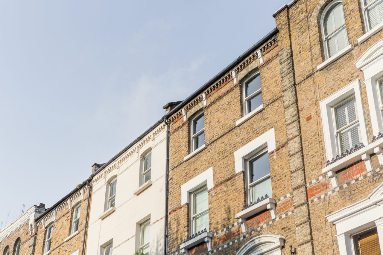
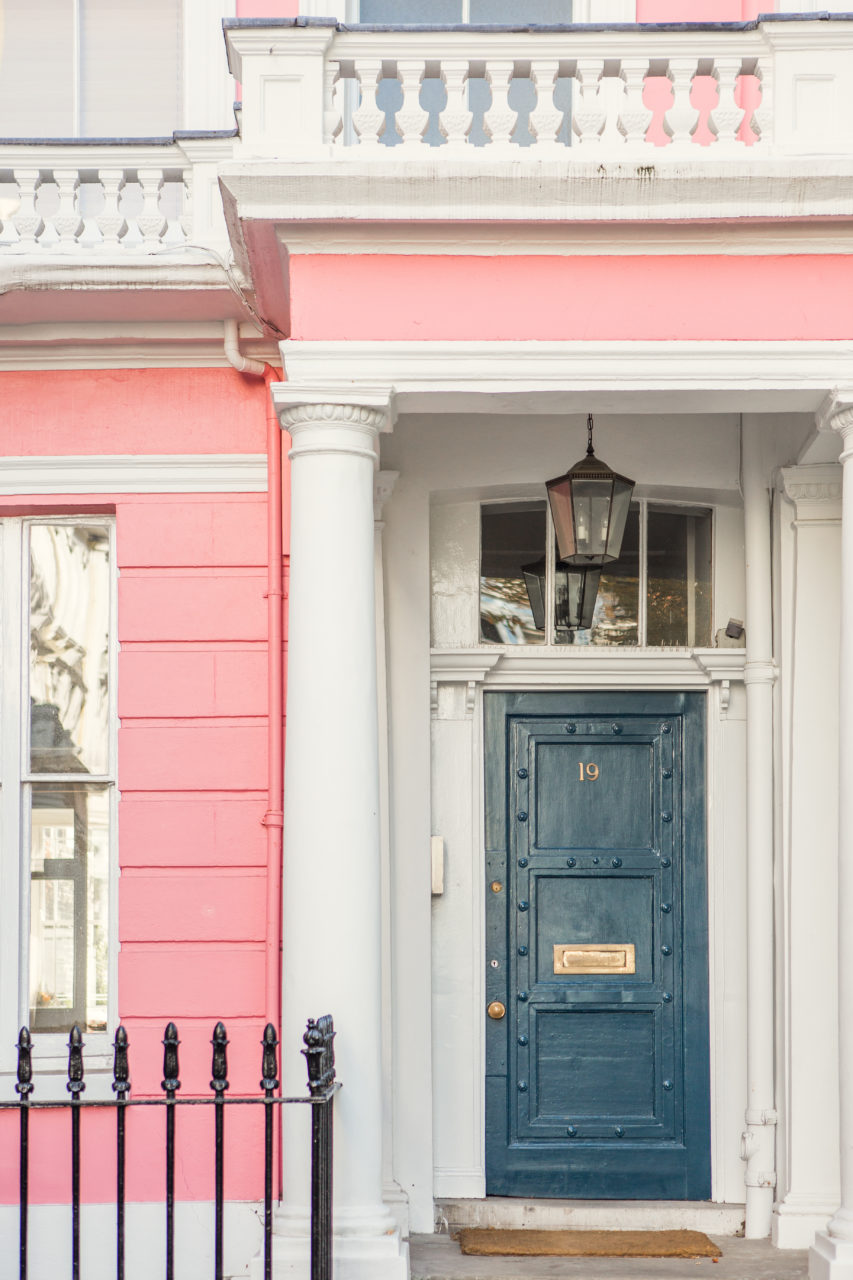
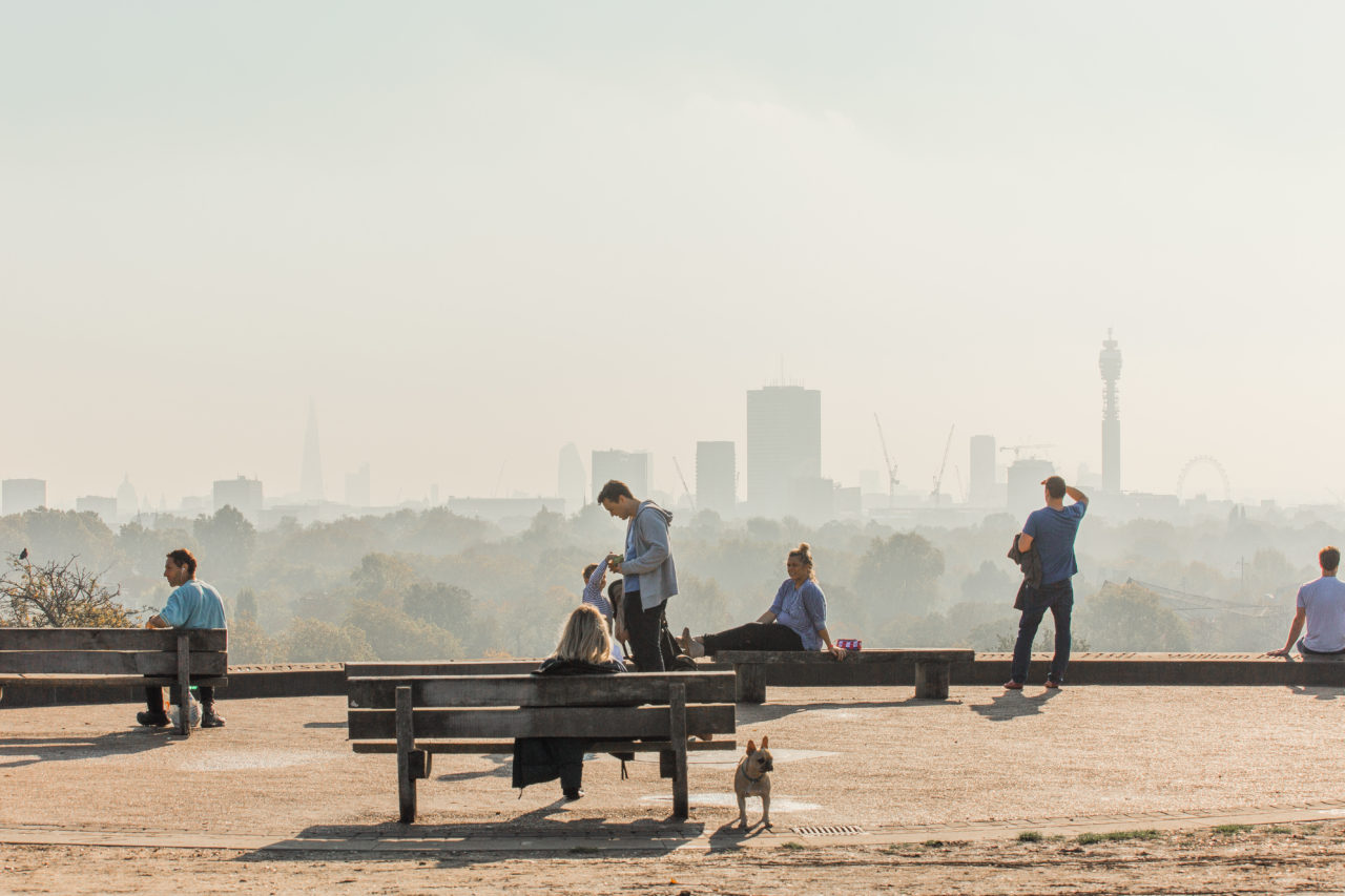
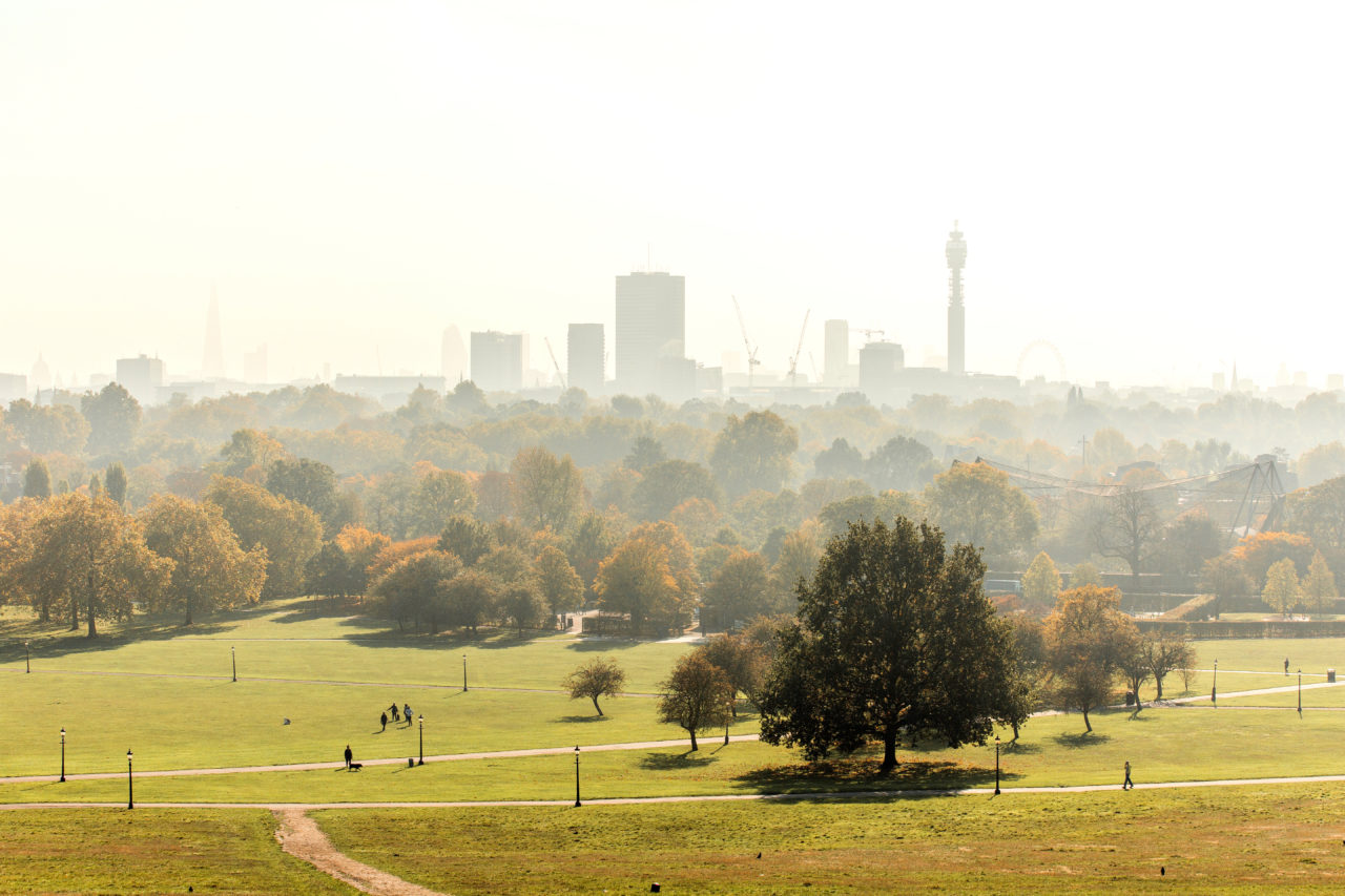
The hip streets of NW3 are now home to a similarly hip new creative hub – Primrose Hill Courtyard. This elegant new development offers a contemporary campus-like workspace with four studios, a communal courtyard and terraces, all in a former warehouse building at the heart of Primrose Hill.

Branding means business
Primrose Hill exudes style at every turn. To attract the attention of creative businesses we needed to produce a brand identity that really stood out. A look that was both different and delightful. That would capture and celebrate the ‘hill’s’ unique, quirky neighbourhood vibe.

Drawing the right crowd
For this on-trend development, we turned to on-trend illustrator, Martina Paukova (Conde Nast, Google and Wired have all commissioned her witty, beautifully busy illustrations). We worked with Martina to imagine the day-to-day working atmosphere of the Courtyard, which she brought to life in a series of bespoke illustrations. We then used them across printed collateral, the website, merchandise and more. A bright red brand colour was selected to add vibrancy and sophistication – inspired by original period features of the building.


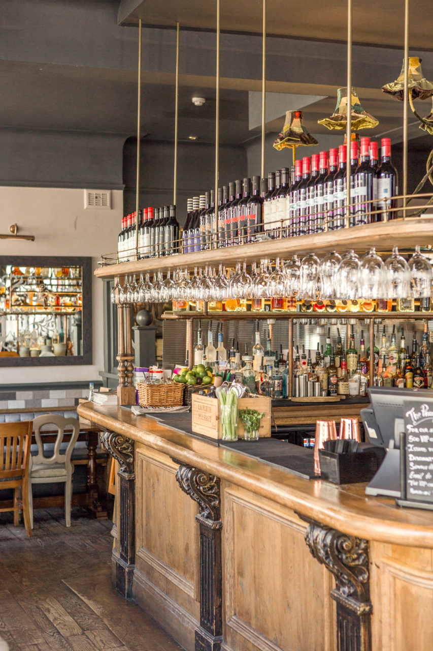
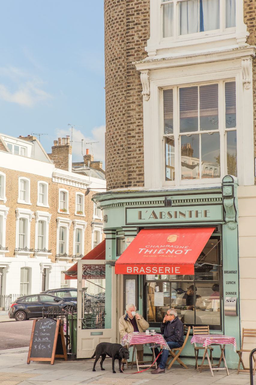
Getting the picture
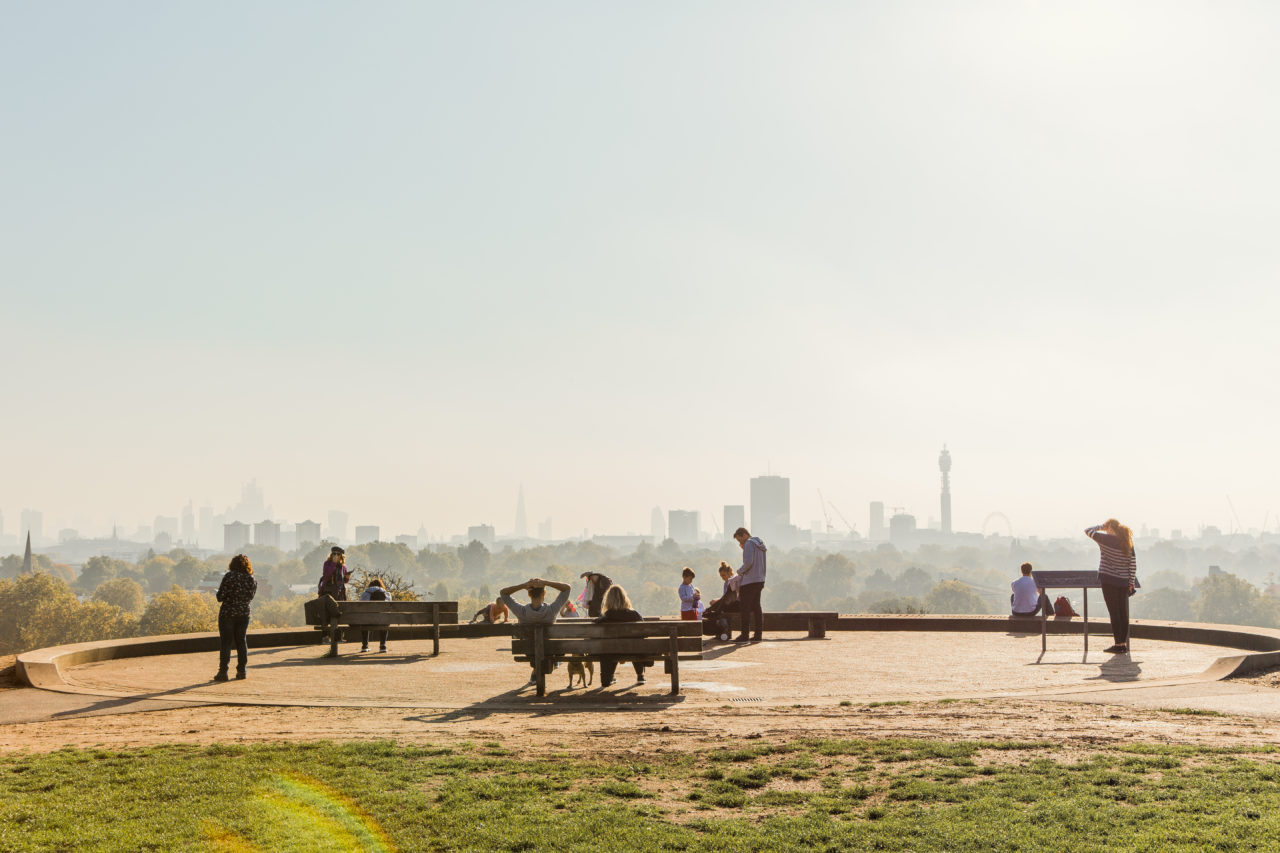
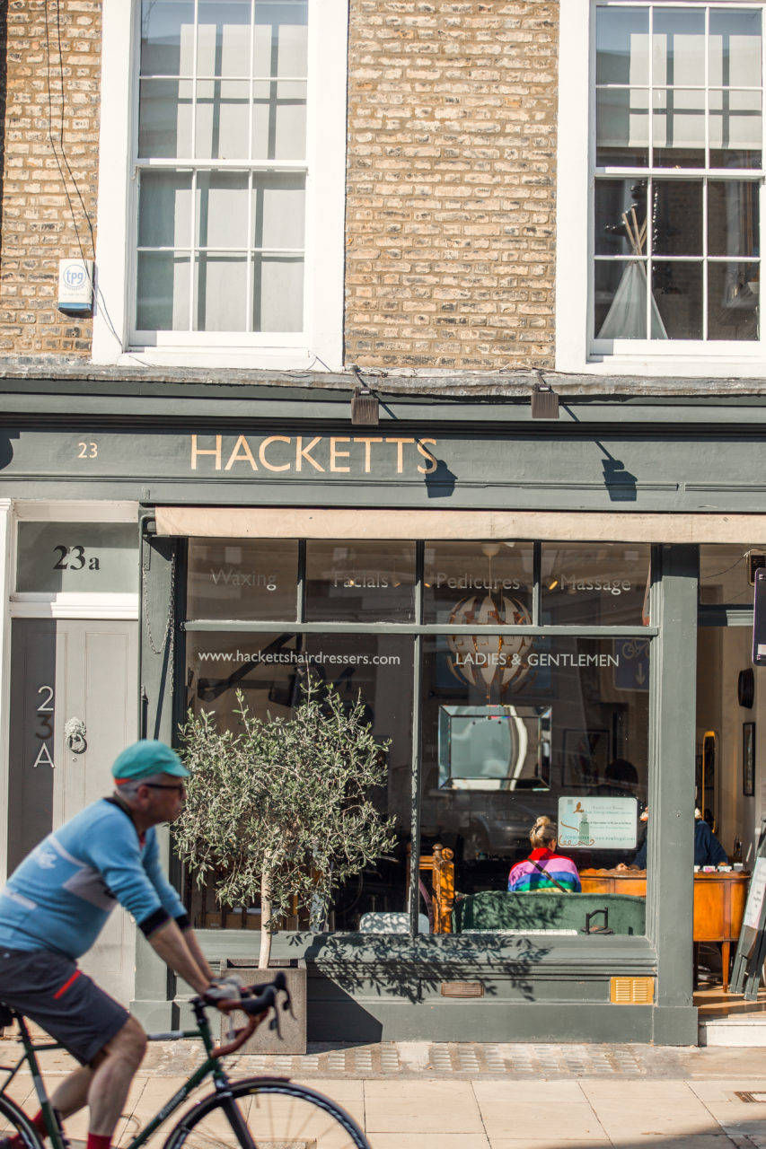
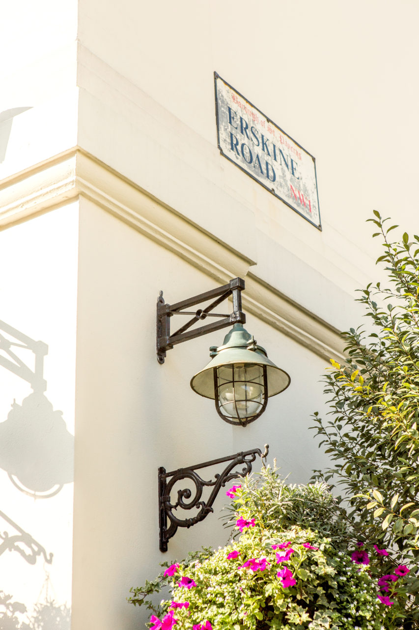
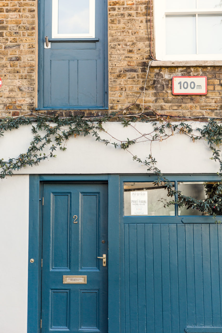
To give prospective tenants a more tangible insight, we also produced a collection of photographs. These worked beautifully alongside the illustrations to demonstrate how working at Primrose Hill Courtyard would feel – the outdoor space, the community, the clean commute and more.


Let’s make something great together
studio@effection.co.uk