Covers
The app that truly caters to the hospitality industry
How we developed the first brand identity for an app built for the restaurant trade.
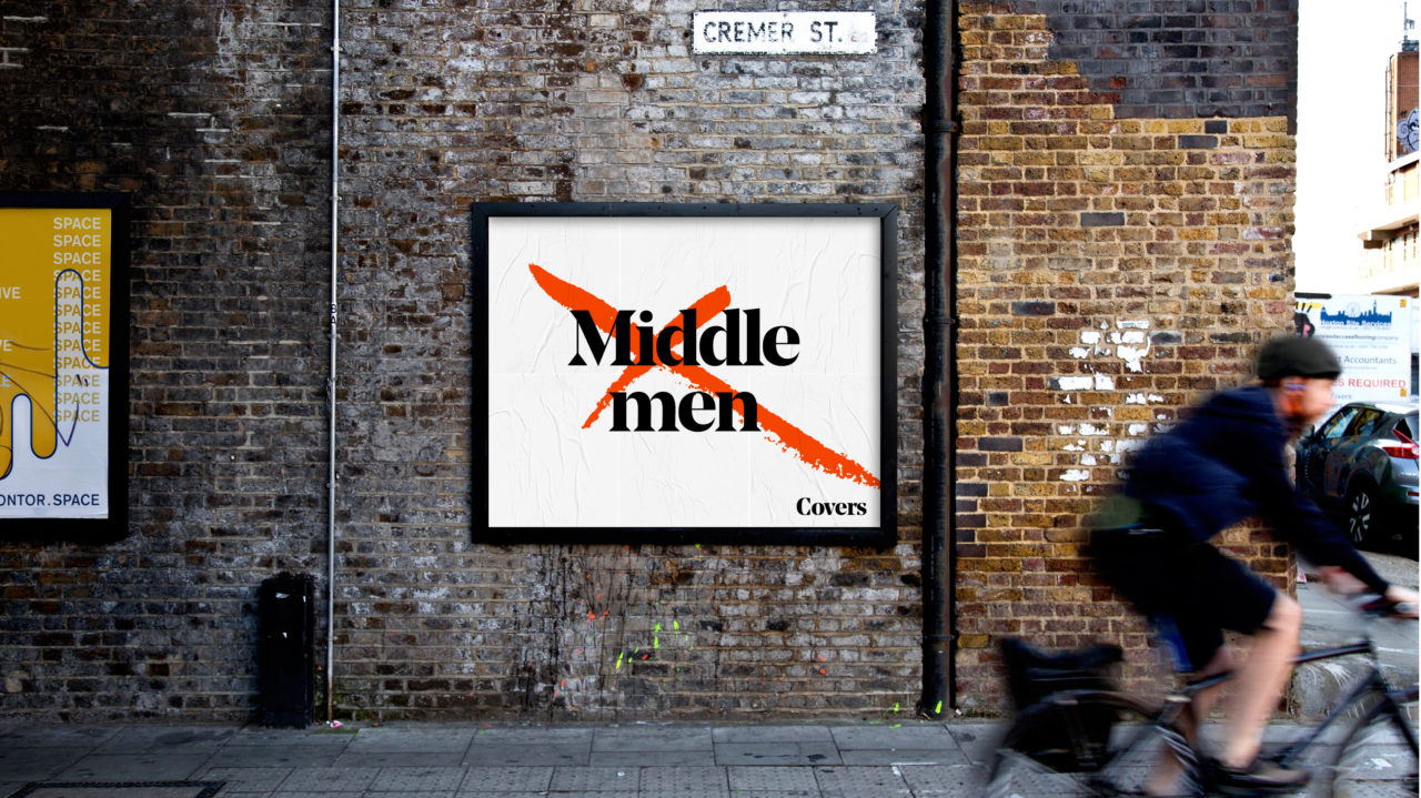
Covers is a tech start-up designed to streamline the hiring process in the hospitality industry. When we came on board, the app, originally named WorkIt, had been developed just enough to get the idea across to investors. Once this raised the capital it needed to grow and hit business targets, their next step was a new brand identity.
Serving up the strategy
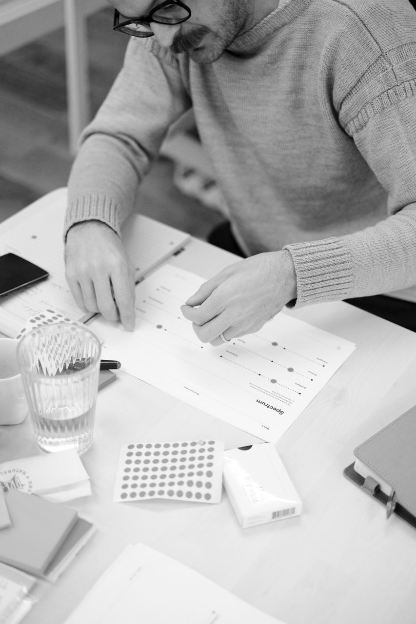
As a starting point we needed to find a clear point of difference as a starting point. To really get under the team’s skin and understand what it was that made the brand unique, we organised a strategy workshop to help throw up some insights. It taught us that WorkIt wasn’t just out to make money, it was set up by people who’d dedicated their careers to hospitality and genuinely wanted to improve the way it worked, as well as the lives of its users.



A new name for a new way of working
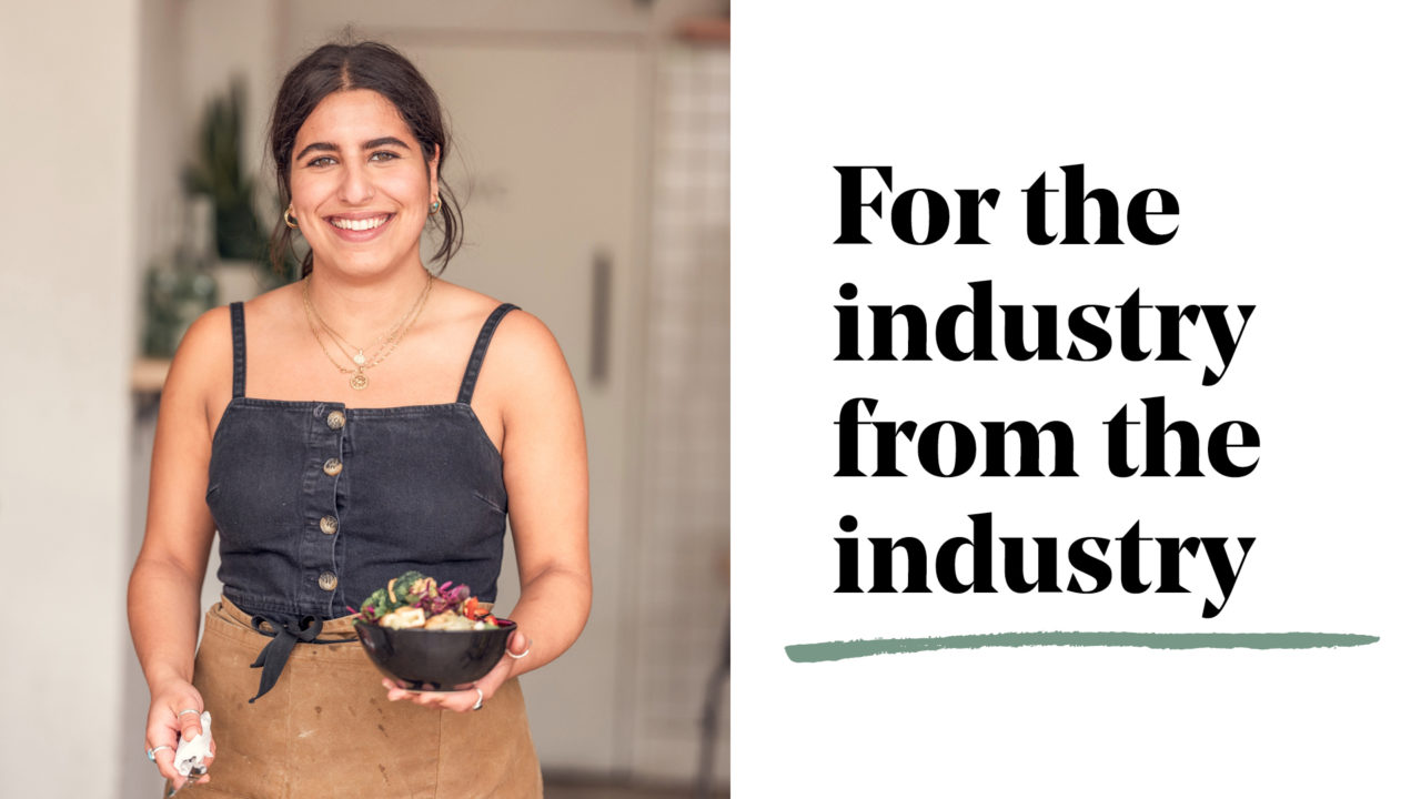
WorkIt was ‘for the industry, from the industry’ and we wanted a new name to reflect that. Covers was right for a couple of reasons; the duality of its meaning (the industry term for waiting staff, plus literally ‘getting cover’) and the simple, no-nonsense personality that we’d already established for the brand.
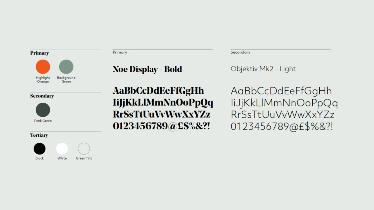
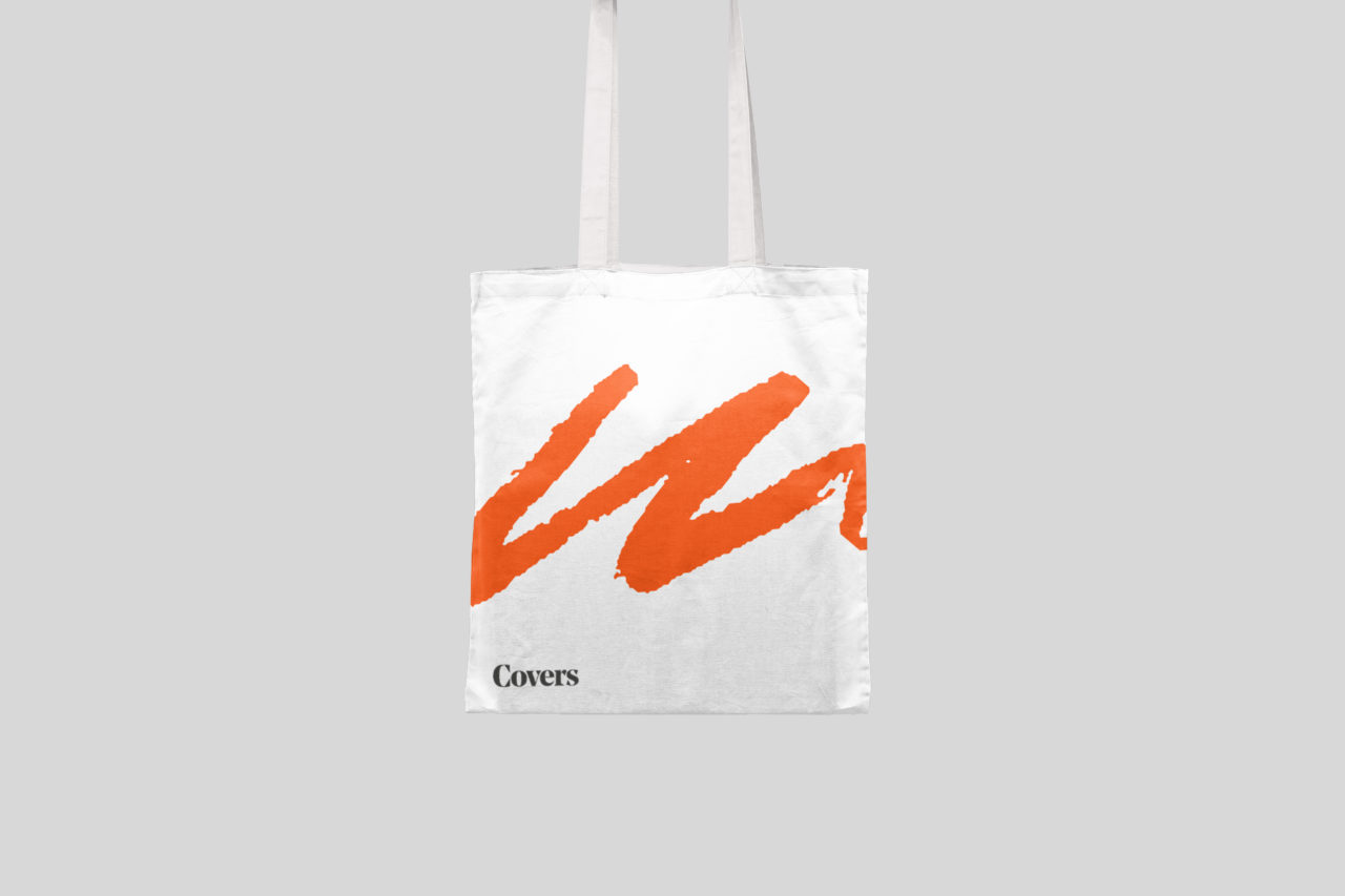
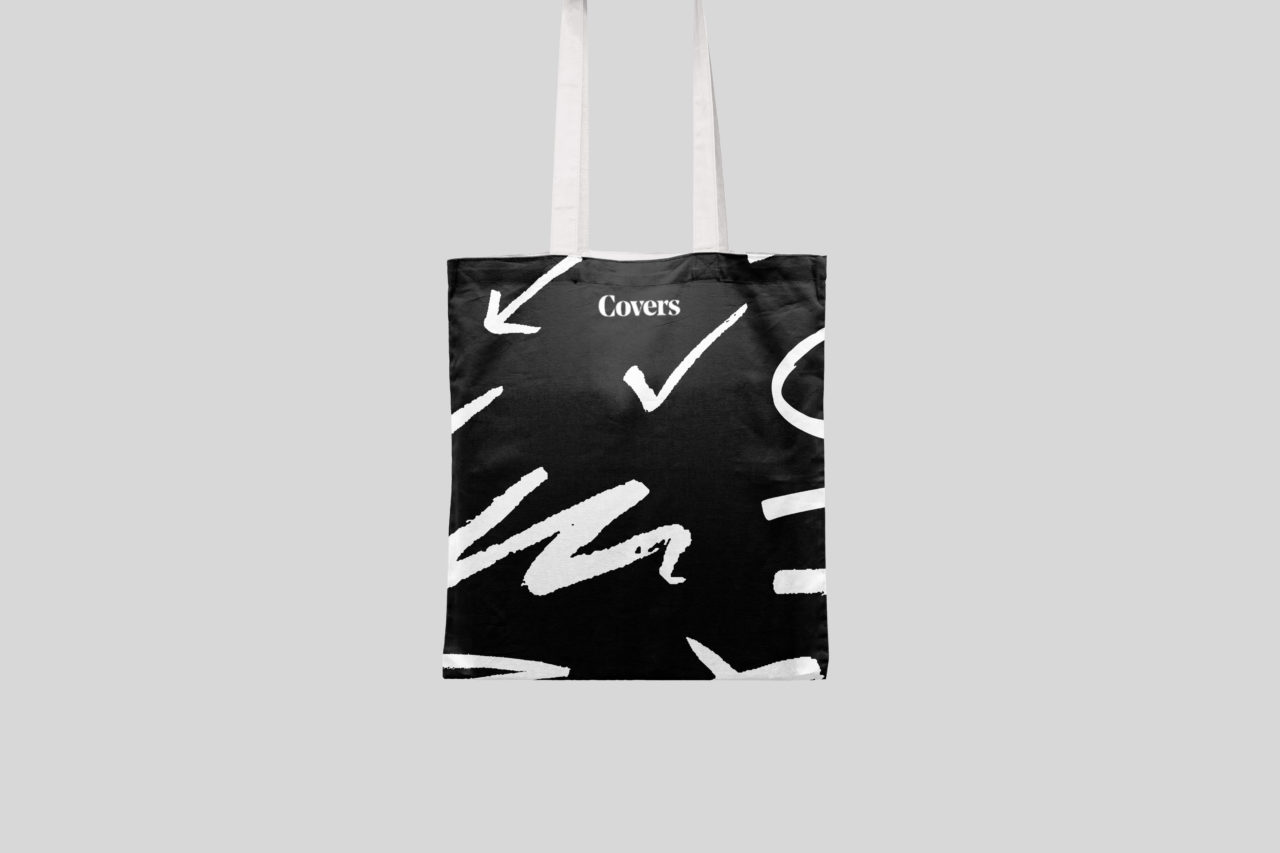
The silver service in visual identity
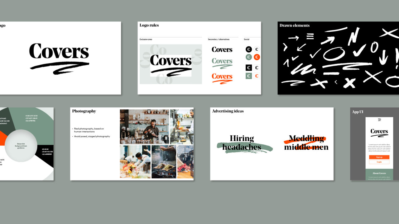
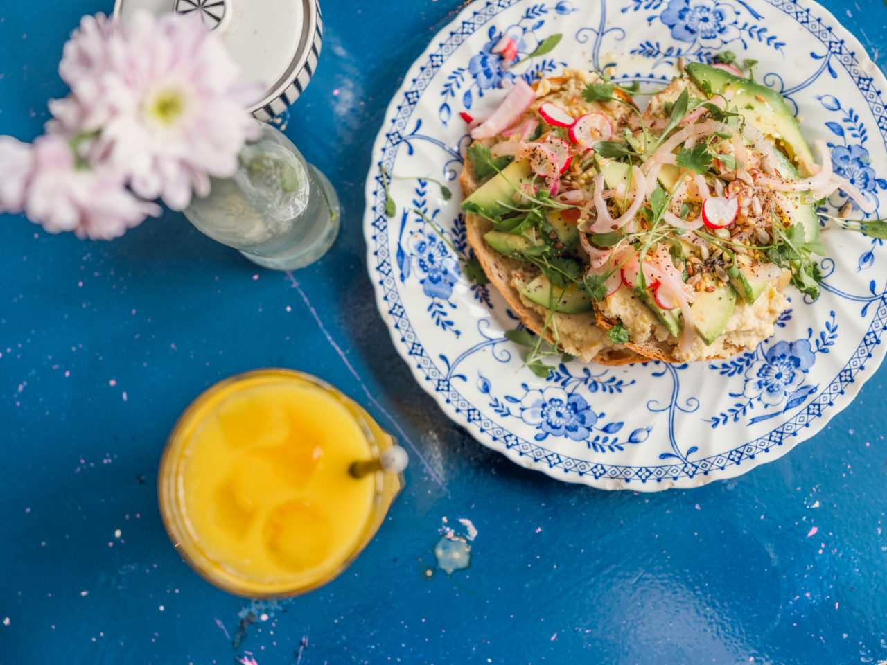
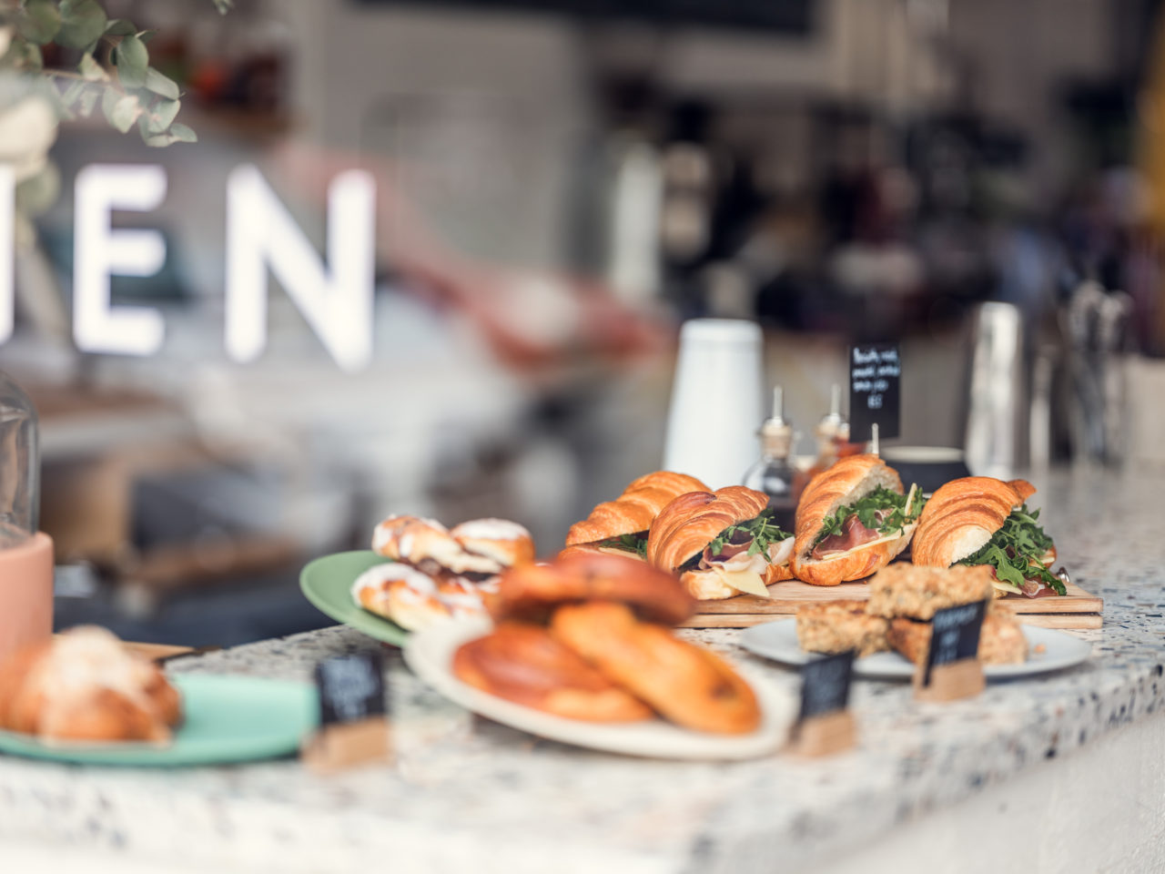
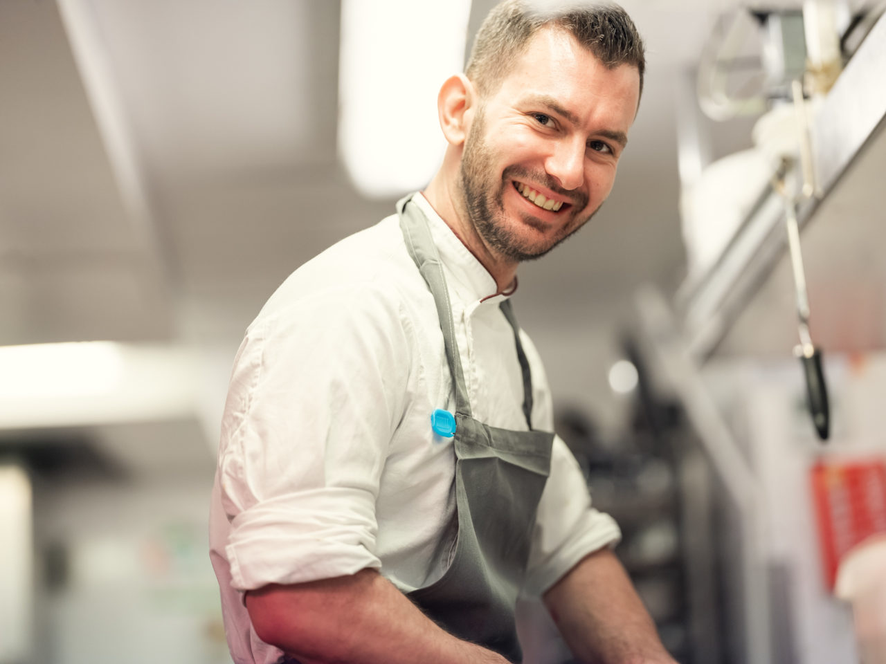
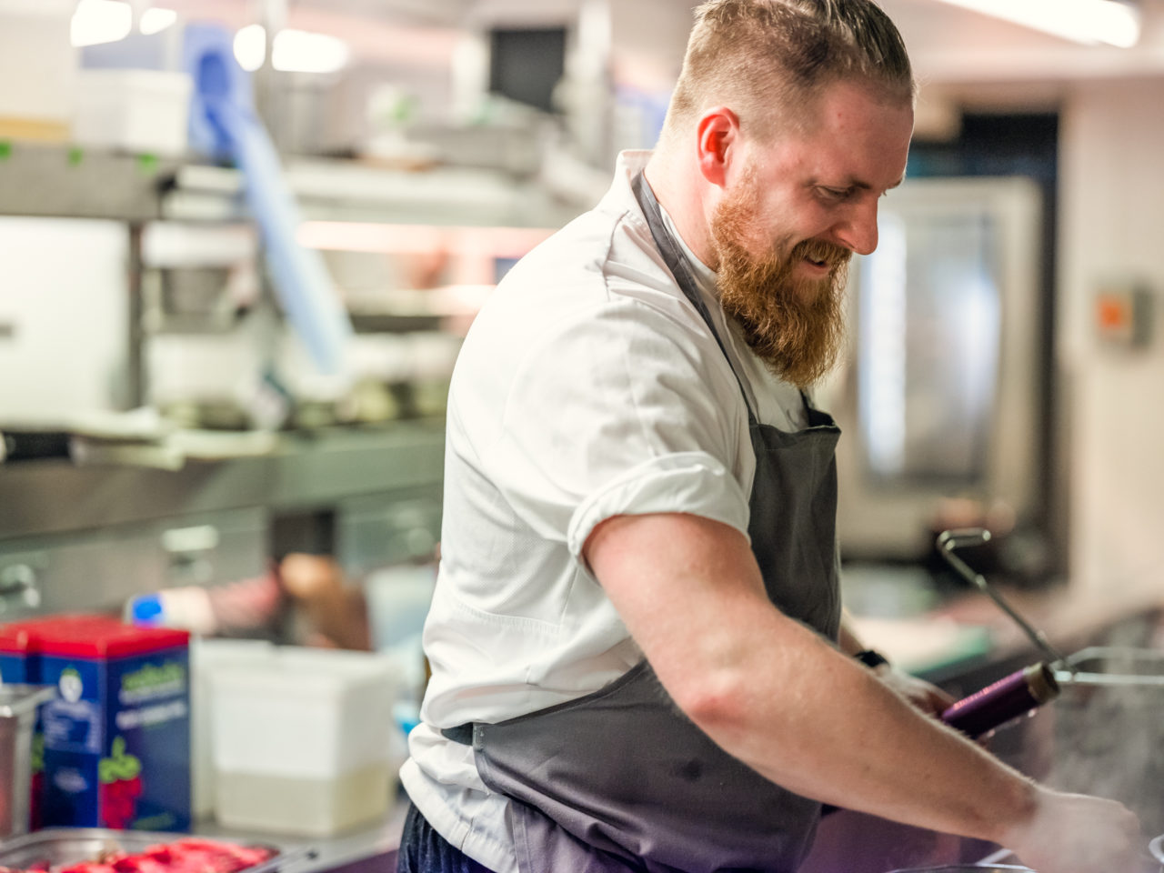
This sense of authenticity was key in our visual approach too. While the competition all showed smiling stock shots and models on the job, our photography featured actual industry staff doing their real jobs (surprisingly novel!) Taking cues from familiar props, such as order pads and checklists also meant we could cut through the category with insights that showed Covers as a brand that could be counted on.







Let’s make something great together
studio@effection.co.uk