Pulse
A new competitor for a smarter city
The UK’s first smart hub, with life-saving capabilities.
Pulse is a tech startup designing a network of ‘smart hubs’ for city centres. Its aim is to keep people connected, share information and save lives.
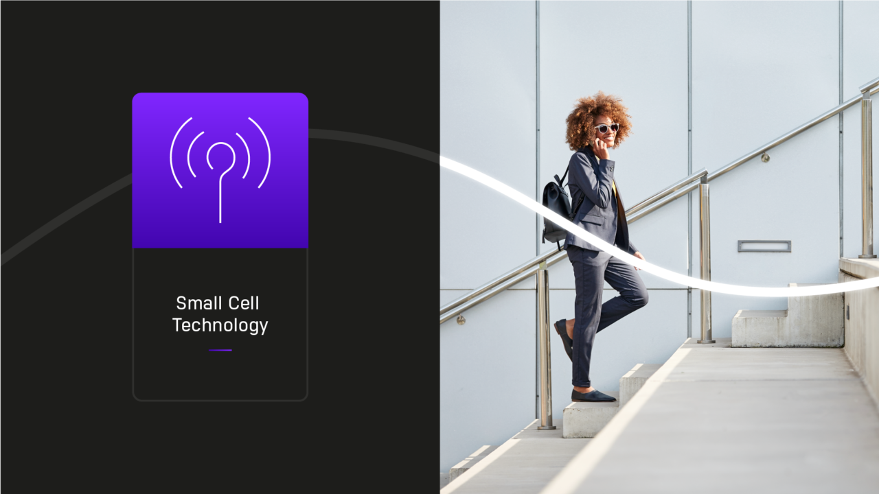
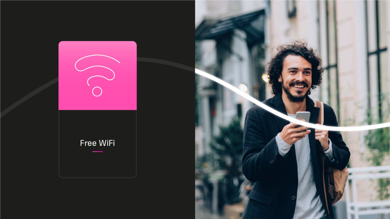
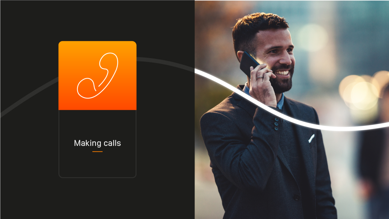
Pulse offers free WiFi, phone calls, maps and device charging. But it doesn’t stop there. Pollution meters, sound sensors and defibrillators are built in, giving local pedestrians the tools to save lives in the event of an emergency.
More information can be found at: https://pulsesmarthub.co.uk/

People-first positioning
Competitors had some brilliant features but as Pulse was all about ‘keeping people connected’ we wanted to stand out in a way that everyone could relate to. It’s why we worked to define a strategy that would call out the benefits in a friendly and relatable way.
A visual identity to match
This mission steered our visual identity with a connecting monoline theme that ran through Pulse’s logo, typography and bespoke icon library. Colours were chosen with two purposes in mind: to make sure the hub was easy to navigate and to bring the marketing to life in an engaging and consistent way.


Brand = Product
Like many of our clients, the brand IS the product and the product IS the brand. We made sure every part of the unit’s design was built with this in mind. Our bespoke icons were used as status lights down one side and the colours matched our visual identity, creating truly stand-out physical assets.
When it came to launching the hubs, we rolled out DOOH ads on the side of the units themselves, as well as designing a website, stationary and other additional marketing materials.
Let’s make something great together
studio@effection.co.uk
